Every year, thousands of patients are harmed because two drugs sound or look almost identical. Tall-man lettering isn’t magic - but it’s one of the simplest, cheapest tools hospitals and pharmacies use to stop those mistakes before they happen.
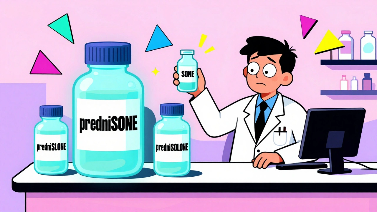
Imagine you’re a pharmacist at 3 a.m. scanning a prescription for prednisone. The screen shows prednisolone. Both names start the same. Both end in ‘-one’. One letter changes - and the difference matters. Give a patient the wrong one, and you could cause serious harm. Tall-man lettering fixes this by making the key difference stand out: predniSONE and predniSOLONE. The capital letters act like visual alarms.
What Is Tall-Man Lettering, Really?
Tall-man lettering isn’t about making letters bigger. It’s about using uppercase letters to highlight the parts of drug names that differ. It’s not new - the Institute for Safe Medication Practices (ISMP) introduced the idea in 1999. But it’s still one of the most widely used safety tools today.
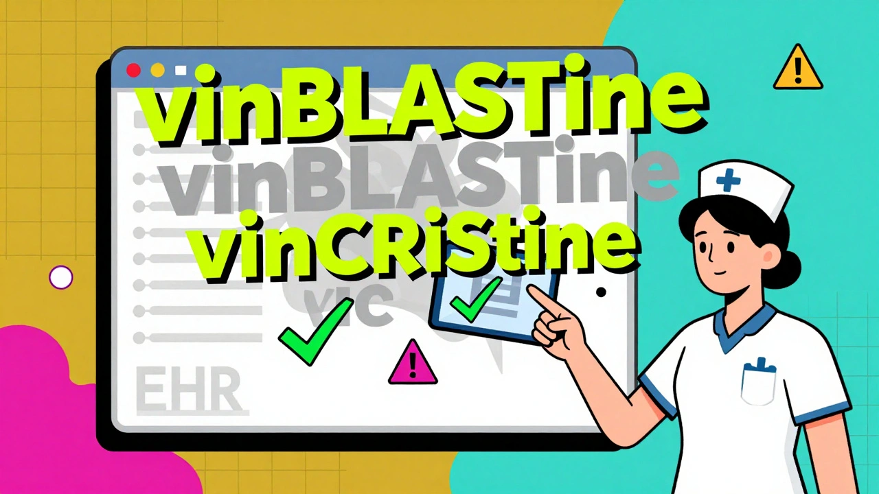
It works because our brains process visual patterns quickly. When you see vinBLAStine versus vinCRIStine, your eyes lock onto the capitalized letters - BLAS and CRIS - and your brain flags the difference before you even read the whole name. That’s the point. It’s not about spelling. It’s about stopping your brain from auto-correcting one name into another.
The FDA and ISMP each maintain lists of drug pairs that need tall-man lettering. The FDA’s 2023 list includes 72 pairs. ISMP’s list is longer - 252 pairs - and updated every quarter. Australia uses its own version, the National Mixed-Case Lettering List, with 192 pairs as of 2022. These aren’t suggestions. They’re standards. Hospitals that don’t follow them risk failing safety audits from The Joint Commission.
How It’s Used in Real Hospitals
You won’t find tall-man lettering just on paper prescriptions. It’s built into every digital system where drugs are ordered, dispensed, or administered:
- Electronic Health Records (EHRs) like Epic and Cerner
- Automated dispensing cabinets (Pyxis machines)
- Barcoding systems that scan drugs before giving them to patients
- Pharmacy labeling software
- Drug databases used by nurses and doctors
A 2022 study in Pharmacology Research & Perspectives tracked a hospital that changed 210 drug names across 13 systems. That meant updating every screen, label, and report where those names appeared. It took 16 weeks - but once done, staff reported fewer double-checks and fewer alerts being overridden.
One nurse practitioner in Melbourne told me: “I used to have to pause every time I saw metoprolol and methyldopa. Now, with METOPROlol and METHYLDopa, I know instantly - no second glance needed.”
Why It Works - And Why It Sometimes Doesn’t
The science behind it is solid. An ISMP eye-tracking study in 2004 showed a 35% drop in selection errors when providers saw tall-man lettering versus standard lowercase names. In high-pressure environments like ERs or ICU units, that split-second difference can prevent a mistake.
But it’s not perfect.
Some drug pairs are too similar at the start. Take alprazolam and lorazepam. If your system shows ALPRAZolam and LORazepam, the capitals are too far apart. Your eyes skip over them. That’s why some nurses complain: “The capitals are too small, or the font is too tiny. I miss them.”
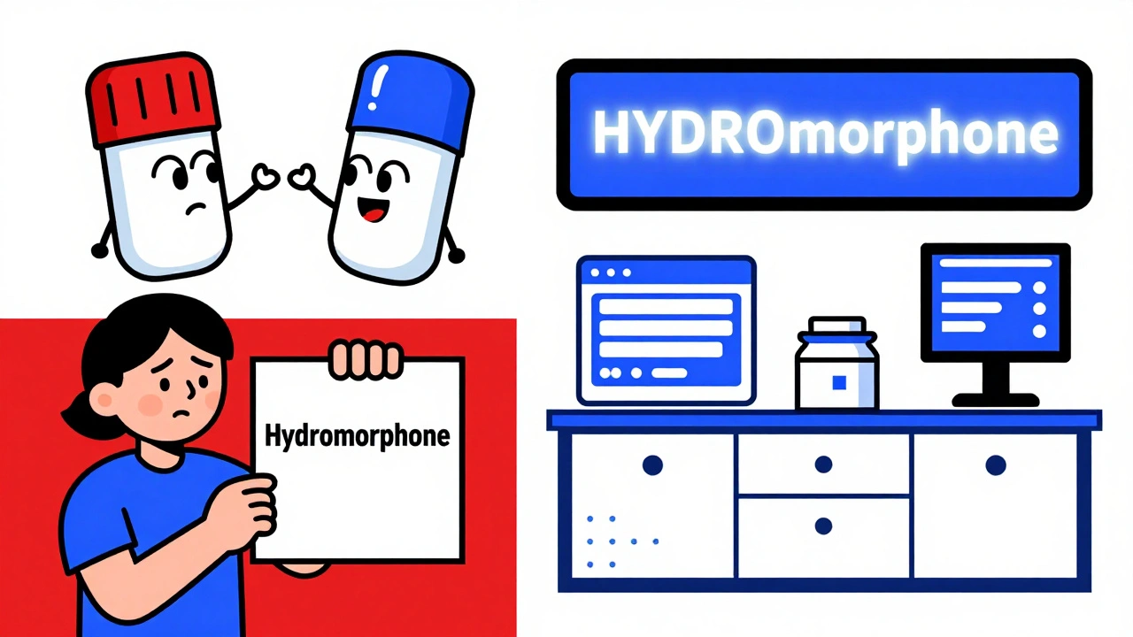
There’s also inconsistency. A hospital might use HYDROmorphone, while the community pharmacy down the street uses Hydromorphone. A patient gets discharged with a prescription labeled one way - but their home pharmacy fills it differently. That’s a gap. A 2023 survey found 63% of pharmacists said inconsistent application across systems made things worse, not better.
And here’s the hard truth: Tall-man lettering alone won’t stop all errors. A 2016 study in Pediatrics found no significant drop in errors after hospitals adopted it. But that study was flawed - many hospitals didn’t implement it correctly. The real problem? People think it’s a fix-all. It’s not. It’s one layer.
What Experts Really Think
Dr. Michael Cohen of ISMP says it best: “Tall-man lettering is not a panacea. It’s one essential layer.”
That’s why it’s always used with other tools:
- Barcode scanning - every drug scanned before giving to a patient
- Independent double-checks - two people verify high-risk drugs
- Forcing functions - systems that won’t let you proceed unless you pick the right drug
The American Society of Health-System Pharmacists (ASHP) gives tall-man lettering a Grade B recommendation - meaning it’s useful, but not enough on its own. The Cochrane Collaboration says evidence for reducing actual patient harm is “low certainty.”
Still, most frontline staff agree. In a 2022 Wolters Kluwer survey, 78% of pharmacists said it improved safety. One pharmacist in Sydney reported a 42% drop in overridden alerts after implementing ISMP’s list in their Epic system. That’s not just theory - that’s real-time error prevention.
How to Implement It Right
If you’re setting this up in a hospital or pharmacy, here’s how to do it properly:
- Form a team - include pharmacists, IT staff, nurses, and a medication safety officer. Don’t let IT do it alone.
- Use the right list - pick one standard (ISMP or your country’s national list) and stick to it. Don’t mix FDA and ISMP patterns unless you’re sure they match.
- Map every system - check your EHR, dispensing cabinets, labels, and printed forms. If it shows a drug name, it needs tall-man lettering.
- Train everyone - don’t assume staff know what it means. Show them examples. Practice with real drug pairs.
- Monitor and adjust - track how often alerts are overridden. If errors don’t drop, the implementation is broken.
Cost? Around AU$1,200 per hospital system in Australia, according to the Australian Commission on Safety and Quality in Health Care. That’s less than the price of one bad medication error.
What’s Next for Tall-Man Lettering?
The FDA and ISMP are working together to unify their lists by mid-2024. That’s huge. Right now, confusion between systems is a problem. Standardization will fix that.
Some hospitals are testing AI that adjusts tall-man lettering based on real-time error data. In pilot programs, it reduced selection errors by 29% more than traditional methods. That’s promising.
But even with voice recognition and AI, tall-man lettering isn’t going away. Why? Because screens fail. People get tired. Systems crash. Visual cues don’t need power. They don’t need Wi-Fi. They’re always there - if you design them right.
As ISMP’s 2023 report says: “Tall-man lettering will continue to serve as a critical visual safeguard even in highly automated systems.”
It’s not glamorous. It doesn’t make headlines. But in the quiet moments between shifts, when a nurse reaches for a vial and pauses because the letters jump out - that’s when it saves a life.
What does tall-man lettering look like for prednisone and prednisolone?
Tall-man lettering highlights the key difference: predniSONE and predniSOLONE. The capitalized "SONE" and "SOLONE" make it visually obvious they’re not the same drug, even at a glance.
Is tall-man lettering required by law?
It’s not federal law, but it’s required by safety standards. The Joint Commission’s National Patient Safety Goal (NPSG.01.01.01) has mandated the use of differentiated drug names since 2004. Hospitals that don’t implement it risk failing inspections.
Which organizations recommend tall-man lettering?
The U.S. Food and Drug Administration (FDA), the Institute for Safe Medication Practices (ISMP), the Australian Commission on Safety and Quality in Health Care, and the American Society of Health-System Pharmacists (ASHP) all support its use. Each maintains its own list of drug pairs.
Can tall-man lettering cause confusion?
Yes - if different systems use different patterns. For example, one EHR might show PARoxetine while a dispensing machine shows Paroxetine. That inconsistency creates more errors. Standardizing across all systems is key.
Does tall-man lettering work for all similar drug names?
No. It works best when the difference is in the middle or end of the name, like vinBLAStine vs. vinCRIStine. It’s less effective for drugs that differ at the start, like metoprolol and methyldopa, where the key letters are both at the beginning.
How long does it take to implement tall-man lettering?
For a 500-bed hospital, implementation typically takes 16 weeks. This includes identifying drug pairs, updating software, training staff, and testing across all systems. Smaller clinics may take less time, but IT support is essential.
Is tall-man lettering used outside the U.S.?
Yes. Australia, New Zealand, the UK, Canada, and parts of Europe use it. Australia’s National Mixed-Case Lettering List is updated regularly and followed by most public hospitals. Adoption rates are around 76% in Australia and 63% in the UK.
What to Do If You See a Problem
If you’re a nurse, pharmacist, or doctor and you notice tall-man lettering is missing, inconsistent, or hard to read:
- Report it to your medication safety officer.
- Check if your system uses the latest version of your country’s official list.
- Ask for training - many staff don’t realize how to use it properly.
- Don’t assume someone else fixed it. If you see a mismatch, speak up.
Medication safety isn’t about one person doing everything right. It’s about every person noticing when something’s wrong - and having the tools to stop it.
Tall-man lettering is one of those tools. Simple. Low-cost. Proven. And still saving lives today.

13 Comments
Michael Robinson
December 10, 2025 AT 08:02It's wild how something so simple can save lives. No fancy tech, no AI, just capital letters. Makes you wonder why we don't do this for everything that could go wrong.
Suzanne Johnston
December 11, 2025 AT 04:51I've seen this work in the ICU. One night, I almost grabbed the wrong vial - the capital 'S' in predniSONE stopped me cold. Not because I read it, but because my eyes caught the visual break. It's not perfect, but it's the quiet hero of patient safety.
Haley P Law
December 12, 2025 AT 20:20THIS. I work in a pharmacy and I used to hate how hard it was to tell apart drugs. Now? I see the caps and I just… know. 😌 No more second-guessing at 3am. Thank you for writing this.
Andrea DeWinter
December 14, 2025 AT 18:17One thing people miss is that tall-man lettering only works if it's consistent across all systems. I've seen a hospital use ISMP but the pharmacy down the street uses FDA format. Patients get confused. Nurses get frustrated. Standardization isn't optional - it's the only way this actually helps.
Steve Sullivan
December 15, 2025 AT 20:35bro this is why i love real safety stuff. no ai, no blockchain, no $200k software. just caps. it's like the universe whispered 'keep it simple' and someone actually listened. also, i think we should do this for airport gate numbers. i keep missing mine because 'gate 12b' and 'gate 12c' look the same lol
ian septian
December 17, 2025 AT 08:43Do it right. Train people. Update all systems. Done.
Andrea Petrov
December 17, 2025 AT 18:41Let’s be real - this is just a band-aid. The real problem? Hospitals are understaffed, overworked, and underfunded. They slap on tall-man lettering so they can say they’re ‘doing something’ while ignoring the root cause. It’s performative safety. The FDA knows this. They just need to check a box.
Katie Harrison
December 19, 2025 AT 12:14I work in a Canadian hospital, and we use the ISMP list - but only half the systems actually follow it. The pharmacy software? Correct. The EHR? Half the names are lowercase. The printed labels? Totally inconsistent. It’s not that the tool doesn’t work - it’s that we don’t commit to it. We want the benefit without the work.
Mona Schmidt
December 19, 2025 AT 18:18It’s worth noting that tall-man lettering isn’t universally adopted even among institutions that claim to follow it. The Canadian Patient Safety Institute recommends it, but implementation varies widely between provinces. Some hospitals use mixed-case, others use all caps for the differing segment - and that inconsistency itself introduces risk. A national standard, enforced through audit, is long overdue.
Guylaine Lapointe
December 20, 2025 AT 14:59Oh please. This is just another corporate wellness fad dressed up as medicine. We’re spending weeks and thousands of dollars to capitalize letters while nurses are still being asked to do 12-hour shifts with no breaks. This isn’t safety - it’s optics. You think a pharmacist is going to notice a capital 'S' when they’re running on caffeine and regret? Please. The real solution is hiring more staff, not changing font styles.
Graham Abbas
December 21, 2025 AT 18:31I remember the first time I saw it - I thought it was a glitch. Then I realized… oh. That’s why they did it. It’s like when you’re reading a poem and suddenly a word is bolded - your brain stops. It’s poetry for the weary. I’ve cried in the pharmacy after a close call. This? This is the quietest kind of heroism.
Ronald Ezamaru
December 22, 2025 AT 14:51My dad was a pharmacist for 40 years. He used to say, 'The best safety tool is a rested mind.' But when you can't rest the mind, you give it something to grab onto. Tall-man lettering is that handhold. I’ve seen it work. I’ve seen it fail. But I’ve never seen it hurt anyone. That’s more than I can say for half the 'innovations' we roll out.
George Taylor
December 24, 2025 AT 07:10And yet… after all this, how many patients still get the wrong drug? You cite a 35% reduction in selection errors - but selection errors aren’t adverse events. They’re near-misses. The Cochrane review says there’s low certainty of harm reduction. So… what’s the point? Are we just making ourselves feel better? Are we just capitalizing letters to pretend we’re doing something? Or is this just another expensive distraction from the real problem: systemic neglect?